The Best Colours for Interior Design in 2016
Looking to pump up the looks of your home with a posh colour palette? It might just work. Check out this list of up-and-coming colours that will be all the rave for interior designers next year:
Marsala
The celebrated “it” colour of 2015, as designated by Pantone, shows all the signs of being a trend well into 2016. This seductive wine-red is just the right bold hue for adventurous colourists. Use it to make any place look sophisticated and absolutely chic. The only con is that Marsala is a bit too harsh for bedrooms, the one place where admirers can gaze at this stunning colour all day.
Pastel Purple
A quirky colour that can instantly make a room stand above the rest. Pastel purple may be soft and easy on the eyes, but don’t underestimate its power. It can make bedrooms sensual, office spaces swanky and living areas idiosyncratic. Pair up pastel purple cushions, bed sheets or carpets with bold wall paint for a trendy design overall. Not many places offer accessories in this colour, except for speciality shops like Threel.co.uk.
Donald Kaufman Colour DKC-3
This deliciously peachy-pink colour is perfect for adding a warm glow to a bedroom without making it too girly. A flatteringly classic colour, DKC-3 is soft to the eyes and feels very cosy. Use it for living rooms for extra comfort on cold, winter nights. It’s already making headways with celebrity interior designers, like Thomas O’Brien, who called it a “buttery peach that almost functions as a shade of light.”
Metallic Grey
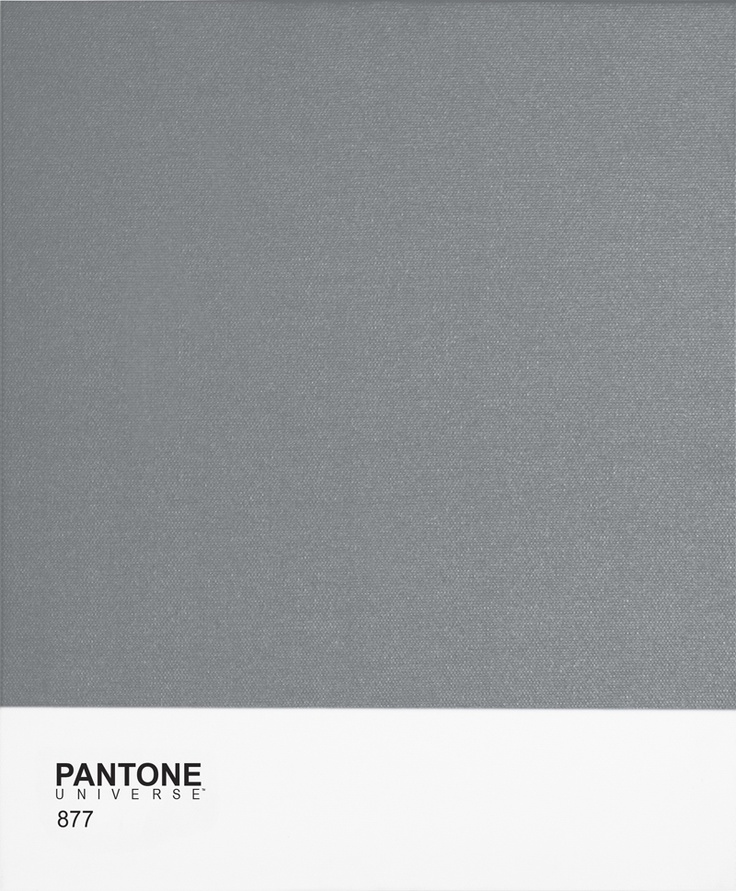
Long gone are the days when grey was considered too dreary for homes. This classic colour is making a McConaughey-esque comeback, and is all set to take over the interior design world in 2016. Metallic grey is not for traditionalists. It’s bold, off-the-wall, and quite shiny. Use this colour in lounges and living areas to wow guests with an otherworldly look. It’ll look perfect in places where electronics are used.
Peacock Blue
Colourists are already predicting that this lively shade will be the Marsala of 2016. Peacock blue is unapologetic in its eye-catching vibrancy, without being too bright a shade of blue. It brings to mind the warmth of a clear day on a tropical beach. It’s luxurious and wonderful for outdoor areas. Use it in bedrooms or bathrooms to feel like you are forever vacationing somewhere exotic.
Clay Beige
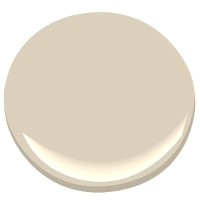
The perfect match between beige, grey and off-white, this elegant colour pulls no punches in being practical and versatile. Clay Beige blends in well in any room or environment. It can be mellow, welcoming, creative and upscale at the same time. Pragmatic colours endure, but don’t become trendy. However, Clay Beige has just the right amount of allure to be snazzy enough to grab attention.
Bridal Pink
Pink is back, kiddos. No longer side lined by stereotypes, eclectic shades of pink are back on the radar of interior designers. The unabashedly feminine bridal pink, with its soothing hues, are at the top of the pinks to make any bedroom, bathroom or kitchen, enthralling. Perhaps due to its ability to look nurturing, bridal pink is the shade of choice for nurseries and children’s rooms.
Revamping your home with a trendy new colour is tempting, but make sure that the other colours of the room complement the new one you’d like to add.


You must be logged in to post a comment Login